How to conduct a Weibull analysis and the questions the analysis will generate.
 Every failure is part of a puzzle. The equipment we are maintaining is trying to communicate with use with each and every failure.
Often the message is not obvious.
There is the immediate failure. And, if we’re paying attention we can sort out the root cause of the failure along with replacing or repairing the damaged parts. Sometimes though the damage is caused by another issue with the system.
Something was hidden.
Keep in mind that for any complex system there are thousands of possible ways it can manifest a failure. From alignment errors to lubrication mistakes, to material degradation or wear, there are clues and indications in every failure.
The Time Element of Data
As you track and record your team’s corrective maintenance activities, you are also gathering essential information to learn about your equipment. Beyond the components involved in the repair, what else did you learn:
- The time of the failure (reported)
- The failure mode or symptoms
- The root cause, possibly
- The corrective action taken to restore the system
I would say the most important element learned is the time of the failure. The time of day isn’t all the important, yet the time since installation or since the last failure involving that part is vital.
As you know, there are different ways, say, a motor can fail. It could be defective or damaged when installed, and it will likely fail shortly after installation. It could be accumulating damage and slowing losing its ability to operating under peak loads. Or, the bearings may be wearing out.
In each case, the remedy, to really fix the issue is different. We need to look at the repair data including the time to failure information.
The Data Analysis
Given any set of data, the first step in the analysis is nearly always a plot. No different when given time to failure data.
Let’s say we have 10 identical motors (same size and from the same vendor) installed across the production line. We know when each motor was placed into service.
Five of the motors have failed and have been replaced. Five have not. A histogram, boxplot or timeline may provide some information. My choice for this type of data is a Weibull cumulative distribution function (CDF) plot.
The Weibull CDF plot is on a log-log set of scales. The horizontal axis is time (could be cycles, operating or calendar time, etc.). The vertical access is the probability of failure, from near zero to 1, often we use 0.01 to 0.99 indicating a 1% to 99% chance of failure.
To plot the data we need to know how long each motor has been in operation. From installation to failure or till the last time we knew the motor was still working (we call this right censoring as we do not know when it will fail in the future, just that it is still running at this point).
Therefore, if one of our motors of the five that have failed, failed 100 days after installation, we will plot the first point above the 100-day point on the x-axis.
One way to do this is to estimate the CDF (or the cumulative percent failure). Intuitively we could use 100 ( i / n ) with my failures out of n units under test. Thus if with 10 motors, the first failure (i=1) time would be plotted at the 10% point on the vertical axis. This method is generally an overestimate or biased.
The approximate median rank estimate is generally accepted as addressing the bias adequately and relatively simple to use. For each time ti, of the i-th failure, calculate the CDF or percentile using 100 ( i – 0.3 ) / n + 0.4 ).
If we have 10 units that have failed out of 10 units or complete data that first point plotted would be at 6.73% and the time of the first failure. And, the 10th point would be at 93.3% and the time of the last failure.
If the 5 failures were from a group of 10 units, as in our motor example, then 5 of the motors are right censored. Using the median rank estimate formula the first point would be at 6.73% and the time of the first failure., in this case, 100 days.
The 5th point would be at 45.19% and the time of the fifth failure.
The Weibull Analysis Basics
After plotting the points on a log-log scale, properly accounting for the motors that have not yet failed (right censored). We have a few dots on a graph. What does this tell us?
Without getting into regression algorithms, like least squares, median ranks, or maximum likelihood, we can simply take out our ruler and align a best-fit line to the data. Draw a straight line that generally describes the location of the data.
If the line fits the data as a straight line (not a convex or concave pattern to the data points) then we may have data that can be described by the Weibull distribution. Basically, if the data describes a straight line as plotted on a log-log graph, the Weibull distribution may adequately describe the time to failure data.
This has a few advantages since the slope of the line, provides information concerning the nature of the failures. It may help us in an investigation concerning the motor failures. Plus, the plot provides a crude indication of the chance of failure over time for the remaining motors.
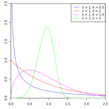
The beta, β, value is called the shape parameter and describes the shape of the distribution, think histogram. It ranges from describing data with a decreasing failure rate over time, β <1, to a data with an increasing failure rate, β >1. When β =1 the Weibull distribution exactly equals an Exponential distribution, and describes a constant failure rate (which is very rare).
If the slope is less than one, the likely causes are faulty motors out of the box, shipping or installation damage, improper installation or similar. A detailed failure analysis may reveal the issue only impacts a small percentage of all motors or impacts all motors, yet the longer the motors run, the less chance that this particular failure mechanism will occur.
I should mention that if the data does describe straight line it generally means there is a single failure mechanism involved. If the line is not straight, it is likely there are two or more underlying causes of the failures. With only five failures, you should rely on root cause analysis as the plot itself may be misleading.
Now, if the slope of the fitted line is greater than one, it indicates an increasing chance of failure over time. This is wear out. The causes are as you would suspect, wear, corrosion, drift, accumulated damage, etc.
What Action Do We Take?
We gather time to failure data, account for censored data, plot data and fit a line. The analysis considers the slope of the line (if straight) and gleans a few clues about the source of the failures.
That’s not all we can learn from the analysis. We can also make a decision about the remaining motors still operating in the plant. Based on the slope of the fitted line, we can decide to leave the remaining motors on the line in operation or plan to conduct some preventative maintenance to replace the motors likely to fail soon.
If the slope is less than one, the remaining motors have a reduced chance of failure than previously. Leave them in operation as replacing them will only increase the chance of failure. Of course, over time other failure mechanisms will appear, so continue to monitor the time to failure data.
If the slope is greater than one, the remaining motors are likely wearing out. This means these motors have an increasing chance of failure with time. Thus, depending on the steepness of the slope, you can project the probability of failure for the remaining units.
If the cost of unplanned downtime is high and replacing a failure motor is expensive, plan on replacing the motors before they fail (or the probability of failure becomes unacceptable.)
Summary
For non-repairable data, a Weibull analysis is a great way to visualize and understand the time to failure data you likely already have available. There are various software packages and tools available to make the fitting the line process more accurate, yet the basics of simply plotting the data can be done on log paper or via your favorite spreadsheet.
Plot the data – a great first step with any data analysis. Learn to read these plots and take appropriate action to improve your program.
I would like to thank Fred for sharing his knowledge on the Weibull Analysis. In the next post, we will explore the Crow-AMSAA Analysis (or Reliability Growth Analysis). Do you use Weibull in your organization? If not, why?
Fred Schenkelberg is an experienced reliability engineering and management consultant with his firm FMS Reliability. His passion is working with teams to create cost-effective reliability programs that solve problems, create durable and reliable products, increase customer satisfaction, and reduce warranty costs. If you enjoyed this article, consider subscribing to the ongoing series at Accendo Reliability.
—
The other articles in the series include:
Post 1 – Using the Maintenance Data You Already Have
Post 2 – The What & More Importantly, The Why of the Weibull Analysis
Post 3 – Quantify the Improvements with a Crow-AMSAA (or RGA)
Post 4 – Using a Mean Cumulative Plot
Post 5 – The Next Step in Data
Post 6 – The Next Step in Your Data Analysis
Post 7 – Data Q&A with Fred & James
—
References:
Fred Schenkelberg
FMS Reliability
Accendo Reliability
New Weibull Handbook
