Utilizing the Pareto Method to Prioritize Improvement Activities
 There is limited time, money or resources in every maintenance department. Sometimes you have 2 of the 3, sometimes just 1. So how do you prioritize the items or issues that will have the biggest impact on your facility? There is a simple, yet vital principle that can be used in your facility to determine which issues to focus on. This principle started in a garden in Italy while studying peas… This principle which started with an observation of peas can have an important impact on your operation.
What is the Pareto Principle?
This principle is known as the Pareto principle and essentially states that the majority of the issues are caused by a vital few causes. It is a common rule of thumb in many industries that states 80% of your results come from 20% of your efforts. The Pareto Chart is one of the 7 Tools of quality which focuses the efforts of any quality improvement on the issues that will yield the greatest return to the organization.
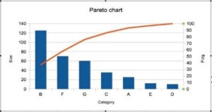
The Pareto Principle uses a chart to visualize the data, showing both bars and a line graph, where individual values are represented in descending order by bars, and the cumulative total is represented by the line.
The left vertical axis is the frequency of occurrence but can be used to represent other factors such as cost. The right vertical axis is the cumulative percentage of the total number of occurrences or total cost. The reasons (on the horizontal axis) are arranged with longest bars on the left and the shortest to the right. In this way, the chart visually depicts which situations are more significant and displays a curved line graph.
Using the Pareto Principle
While not exhaustive, the procedure to use a Pareto chart is relatively simple, but let’s first discuss when to use it;
- When analyzing data regarding the frequency of problems or causes.
- When there are many problems or causes, and you want to focus on the most significant items.
- When communicating with others about your data. The visual nature of the Pareto chart enables others to easily understand the data with little effort.
Now that we know when to use a Pareto chart, let’s look at how to develop one;
- Decide what measurement is appropriate such as frequency of occurrence, time or cost.
- Determine what period of time the Pareto chart will cover
- Collect or assemble the data
- Subtotal the measurements for each category.
- Construct and label bars for each category. Place the tallest at the far left, then the next tallest to its right and so on.
- Calculate the percentage for each category
- Calculate and draw cumulative sums
Creating a Pareto Chart can easily be done using Microsoft Excel with a bar graph and adding a line graphs as a second data set. There are many excellent resources on how to do this in Excel, but if you need assistance, please do not hesitate to contact [email protected].
With the chart complete, the biggest issues can easily be identified and focused on. However, it is my opinion that at least two Pareto charts be used when focusing on the data. For example, create one to focus on the frequency of the issues and the other to focus on the time lost due to the issues. This will help to better understand the data and the true impact on the organization. By being able to look at the data with multiple lenses, the biggest issue can be identified and focused on. So what are you waiting for, try the Pareto chart now?
Do you use a Pareto chart in your organization? If so, what advantages/disadvantages do you find with it? If not, what is preventing you from using it? Please comment and discuss your experience with the Pareto chart and principle.
Remember, to find success; you must first solve the problem, then achieve the implementation of the solution, and finally sustain winning results.
I’m James Kovacevic
Eruditio, LLC
Where Education Meets Application
Follow @EruditioLLC [/fusion_builder_column][/fusion_builder_row][/fusion_builder_container]